KCX by GETRAC website
A showcase website, with a catalogue covering more than 2,600 active products, synchronised from a PIM dataset.
- Company website
- Live
- 2025
- Design, front-end and back-end development, deployment
- Solo builder with marketing, sales and product-data stakeholders
- Built as part of my role at KCX by GETRAC
- P95 product-grid endpoint latency around 80 ms after caching and materialised views
- Account-free product lists that can be shared, exported or printed
- More than 2,600 active products synchronised from a broader PIM dataset
- Figma · Next.js · PostgreSQL · Qdrant · Redis · Cloud Run · OpenAI API

Context
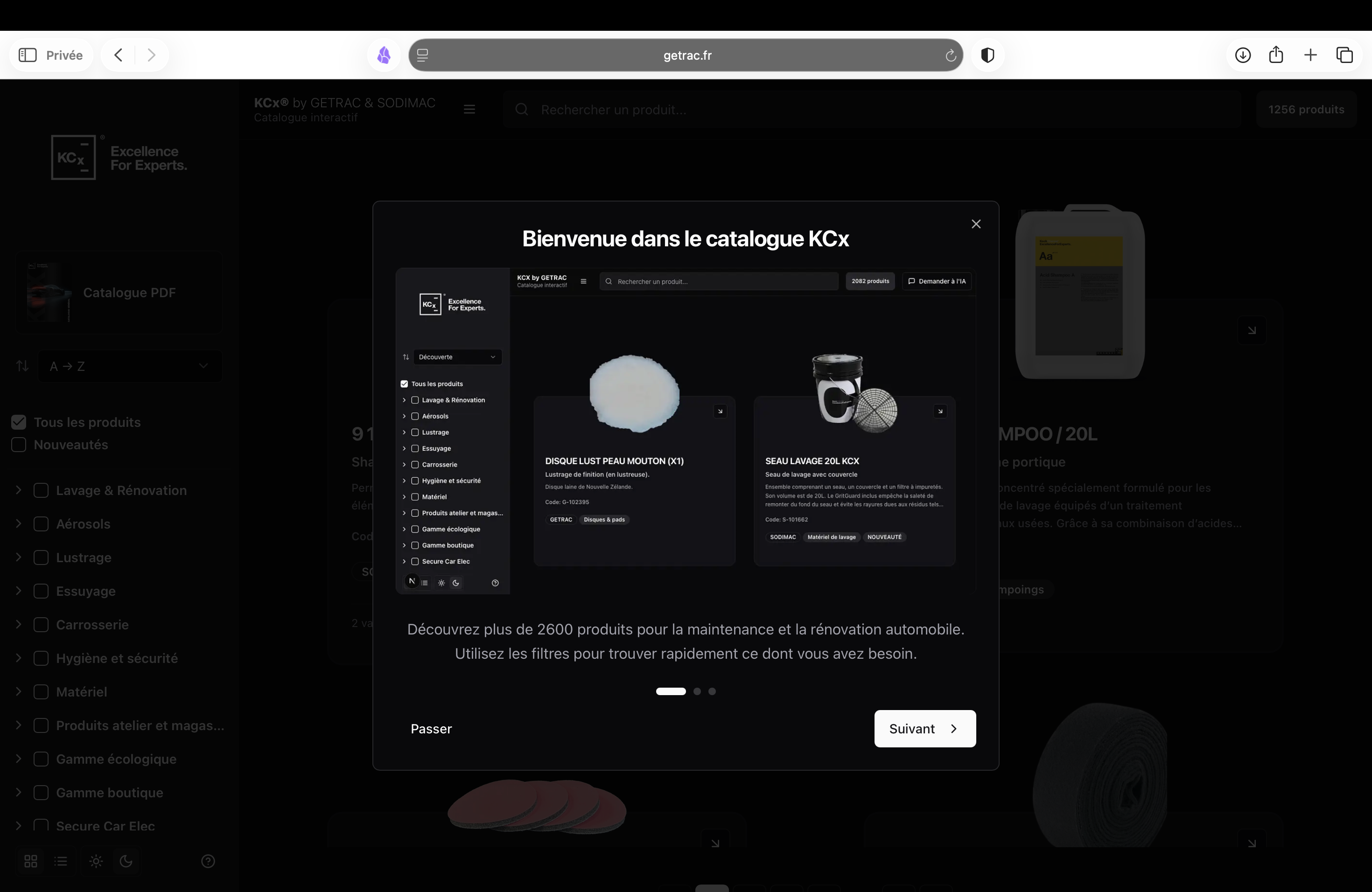
KCX sells more than 2,600 active products across eleven families, through three brands, to professional buyers: garages, dealerships and detailing shops. They do not sell online. The site's job is discovery and specification, not checkout: help a buyer find the right product, understand it, and hand a precise selection to a salesperson.
That makes it an unusual brief. All the machinery of e-commerce, search, filters, comparison and a cart are useful, but the destination is a conversation rather than a payment.
Constraint
Three things pulled against each other. The catalogue had to feel like a considered brand object rather than a database dump. Product data changes continuously in the PIM, so nothing could be hand-maintained. And the buyers who matter most are often standing in a workshop on a phone with one hand free.
A periodic table as the homepage hero
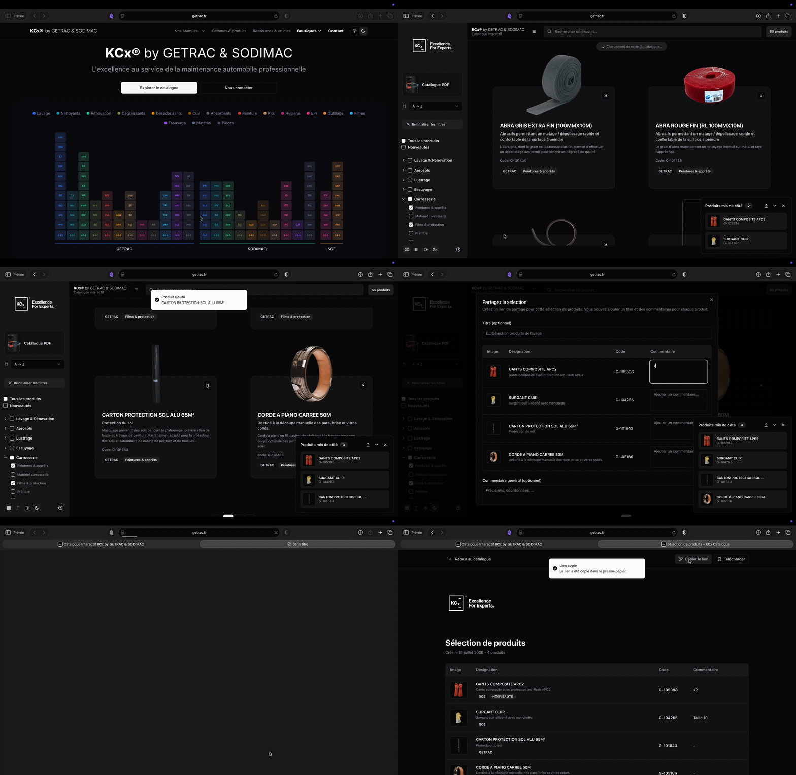
The homepage replaces a hero banner with a periodic-table visualisation of the catalogue. Ninety-nine hand-picked products are laid out as elements, grouped in columns by range and in three blocs by brand, borrowing the visual grammar of the KCX umbrella brand: element tiles, symbol abbreviations, colour-coded families, a legend that toggles families on and off.
Set aside, then share
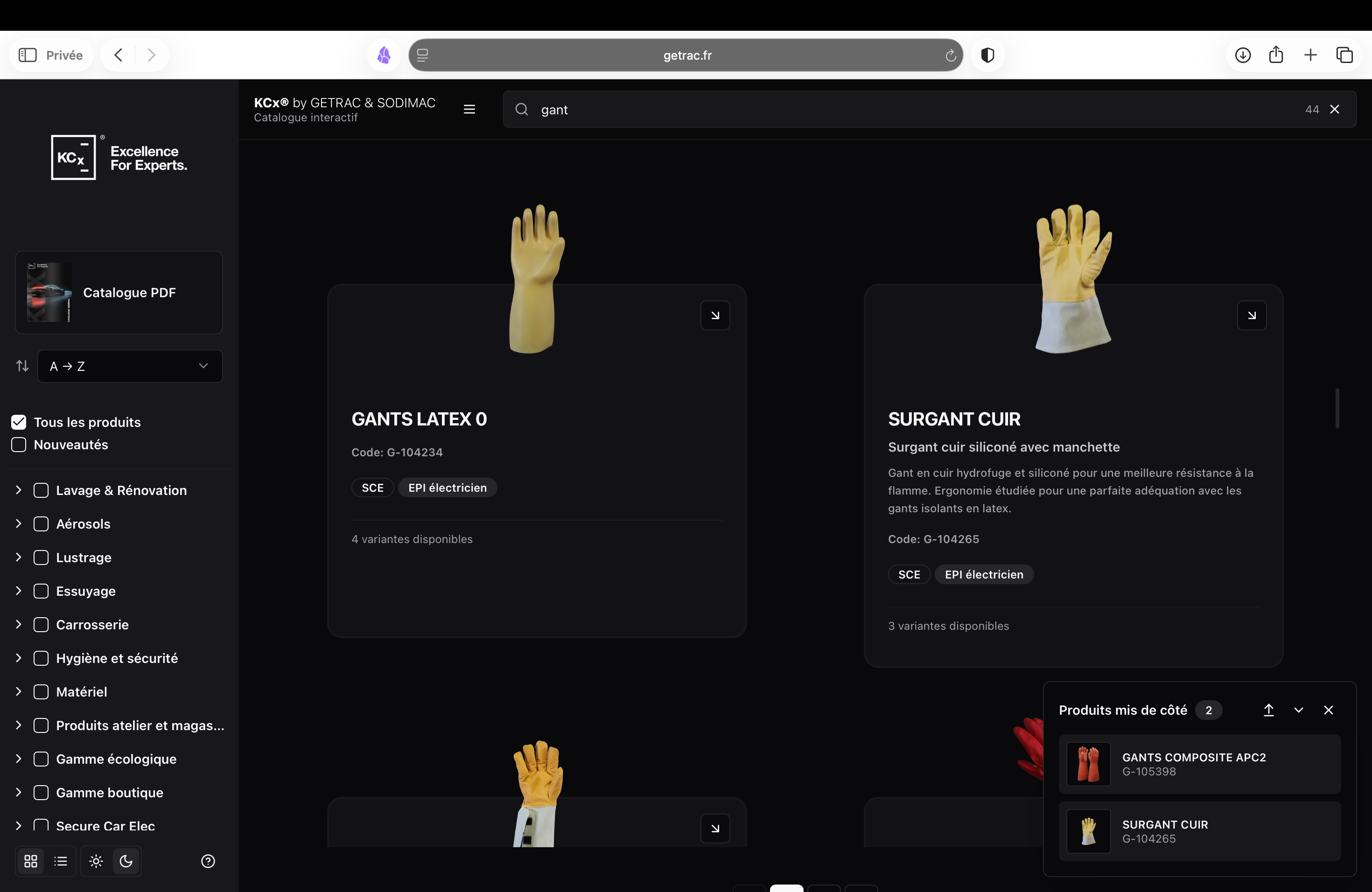
Buyers can set products aside while browsing, a cart with no checkout. State lives in local storage, so there is no account, and it syncs across tabs through the native storage event. Once two or more products are set aside they can be compared by the AI panel, or turned into a durable public URL.
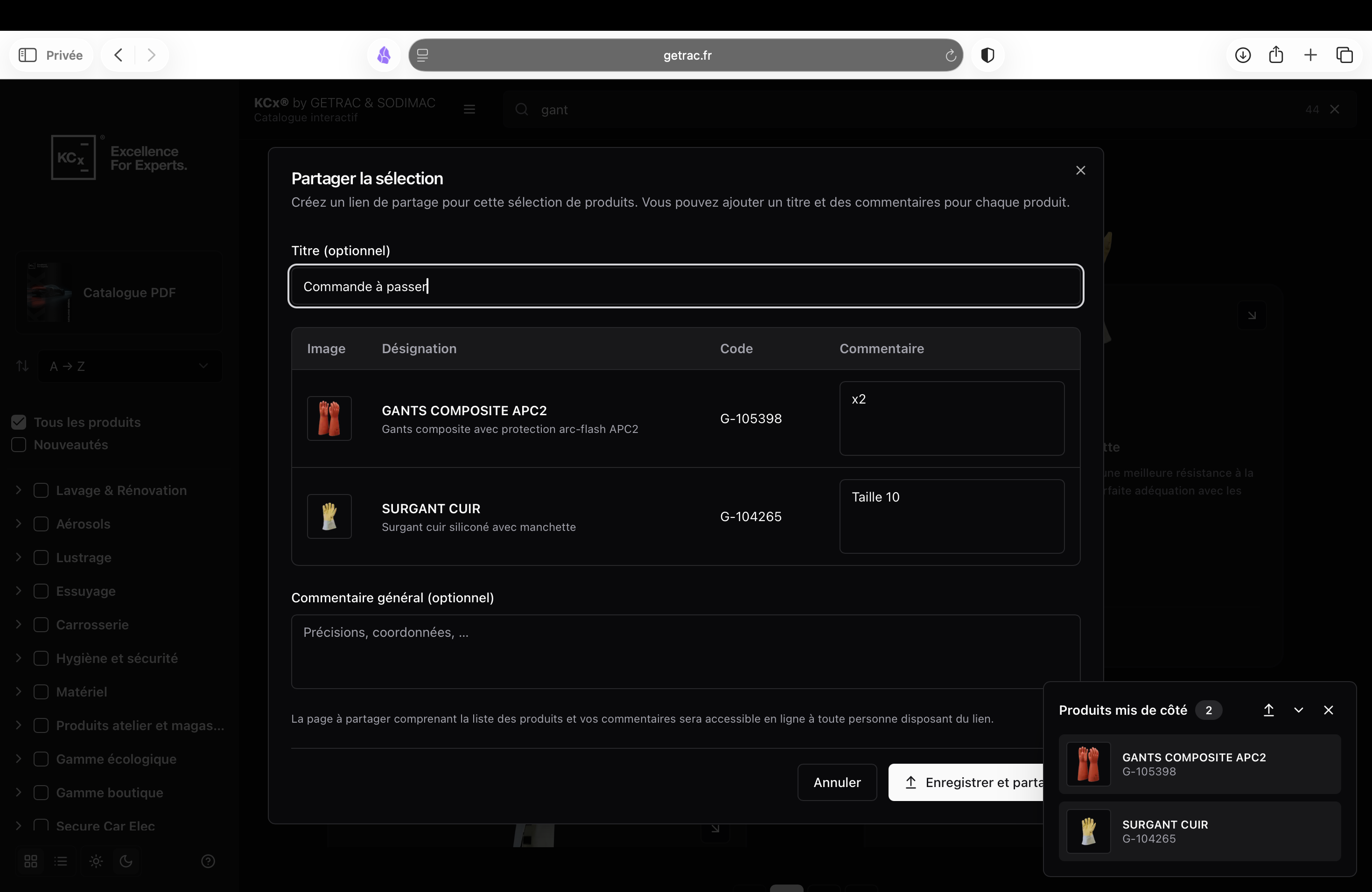
That share flow is the part that earns its place. A salesperson assembles a selection, adds a per-product comment such as "need this in the 5 L size", and sends a link. The recipient sees a standalone page they can export to Excel or print as a clean quote sheet. No login on either end. Here is a real one.
Two-tier search
Search runs cheap-and-precise first, expensive-and-semantic only as a fallback. A tuned fuzzy matcher handles typos and French accents, weighted across name, subtitle and product code. If that does not return enough confident matches, the query is embedded and searched against a vector database.
Multi-word queries get handled separately: each keyword is embedded and searched independently, then the ranked lists are merged with reciprocal rank fusion, with a boost for products matching every term. So "tache carrosserie" rewards products that satisfy both words over one that strongly matches only the first.
Ranking also accounts for how complete a product record is. A decent keyword match on a richly documented product outranks a technically closer match on a near-empty one, because the second one is a dead end for the buyer.
Key decisions
Build the mobile zoom instead of using the browser's
On narrow screens the whole periodic grid is scaled down to fit, which makes tiles too small to tap. Native pinch-zoom would have zoomed the entire page, including the modal that opens on tap. So the component runs its own zoom-and-pan viewport: first tap zooms 2.4× around the tapped tile, second tap opens the product, dragging pans with edge-clamping. More code than deferring to the browser, but the browser's behaviour was actively wrong here.
Move the sync off the platform rather than fight the timeout
A full PIM sync takes seven to thirteen minutes, well past the serverless function limit. Rather than shard it into artificial chunks, the sync moved to a dedicated worker that can run for an hour, answers a trigger with an immediate acknowledgement, and holds a distributed lock so two runs can never overlap.
Self-host the product images
Image optimisation on the hosting platform is quota-metered per account, and the periodic table alone renders ninety-nine product photos. Self-hosting those images was a cost constraint driving an architecture decision, not a technical preference.
Select the sixteen columns the grid renders, not all forty
The product-grid endpoint originally selected every column, including rich HTML descriptions and multiple photo arrays the grid never displays. Narrowing it to what is actually rendered cut the payload by around 75% with no functional change. The detail view fetches the rest on demand.
Impact
Live at getrac.fr, auto-deployed from main.
P95 endpoint latency measured during application profiling on the production dataset.
- Product-grid query endpoint
- More than 2,600 active products, 50-product response
- Production dataset, Cloud Run and PostgreSQL
- ≈500–800 ms · 250 KB payload per 50 products
- ≈150–200 ms · 62 KB
- ≈80 ms · 62 KB
The techniques were unglamorous and worked: column pruning, a smaller default page size, tiered caching with hit/miss logged so effectiveness is observable in production, indexes on the columns actually filtered on, a materialised view pre-aggregating filter counts, and static pre-rendering for the 500 most important product pages.
Limitations and next steps
The next steps are to add professional accounts and implement a proprietary online flipbook system.