Inner Goods
A store selling the needs that objects only pretend to solve.
- Design fiction
- Shipped
- 2026 to ongoing
- Concept, brand, copywriting, art direction, AI workflows, storefront build
- Solo project with a shared visual and copy system
- Independent speculative project
- Nine product identities across four higher-need families
- A shipped storefront at innergoods.store
- Design fiction · AI image generation · ComfyUI · Seedream 4.5, 5.0 Lite and 5.0 · GPT Image 2 · Next.js
Context
The starting point was the book How to Reform Capitalism from The School of Life: an invitation to look at how markets and advertising turn human needs into purchasable signals to "basic" goods that doesn't really tackle the actual needs. Inner Goods takes that idea literally and asks what happens when the object admits it cannot deliver the need being sold.
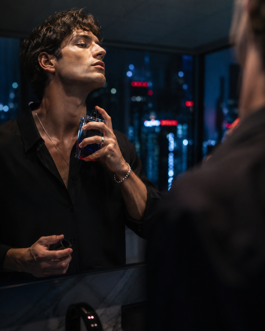
Advertising has been selling higher-order needs through objects for about a century. Confidence is sold as a fragrance. Courage is sold as an energy drink. Everyone involved understands the substitution is imperfect, and it works anyway.
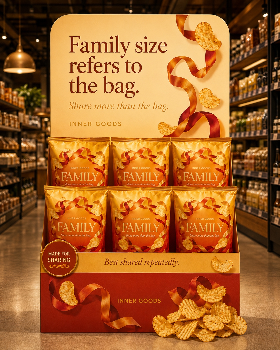
Inner Goods takes that substitution literally and builds a retail brand on it. Nine products for nine needs: belonging, family, confidence, courage, focus, creativity, calm, perspective and self-knowledge, grouped into four need families. Each one is a real object of the kind that genuinely gets sold this way: a tea ritual set, a bag of sharing crisps, an eau de parfum, an energy drink, dissolvable oral strips, a paint set, a soap bar, a pair of sunglasses, a compact mirror.
The joke is not that these objects are useless. It is that they are adjacent: they do something real, just not the thing the advertising implies.
Constraint
Satire that only mocks is boring, and it lets the audience off the hook. The design problem was to build something genuinely desirable, a brand you would plausibly buy from, and then let the honesty do the work from inside, rather than framing it as a parody from outside.
The production constraint was equally strict: every image had to be generated with AI. I did not allow manual retouching in Photoshop, compositing or paintovers. That limitation kept the image-making process inside the project and made consistency across products, situations and packaging a real design problem.
Desirable, not dishonest. Dry, not cynical.
What I made
A complete retail identity: nine products with packaging, campaign imagery, point-of-sale material and a full copy system, shipped as a non-commercial storefront at innergoods.store.
An explicative Manifesto about the project is available at innergoods.store/manifesto.
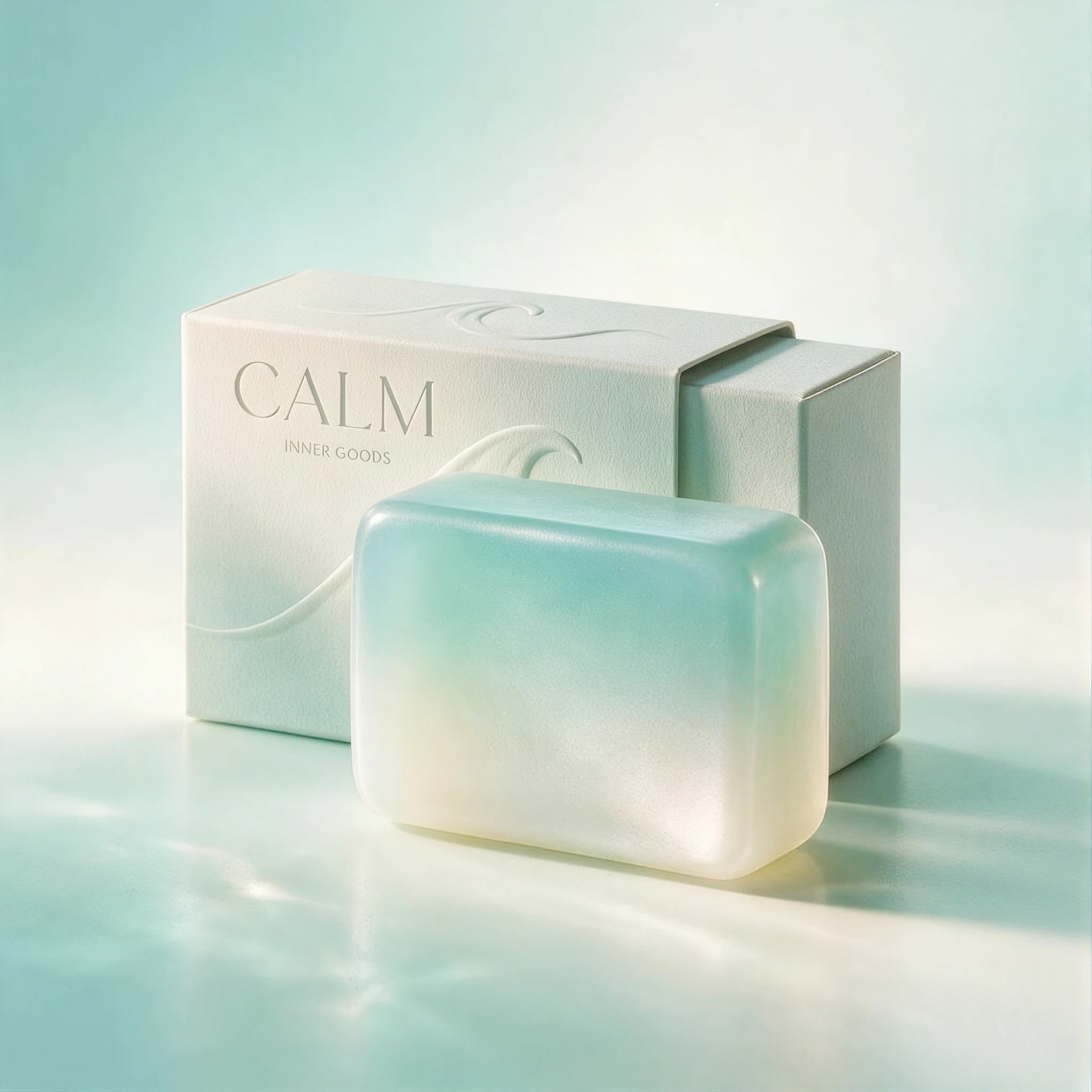

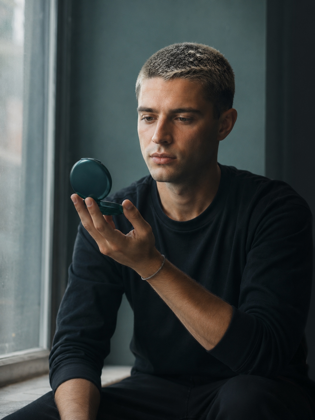
Situations, not just packshots
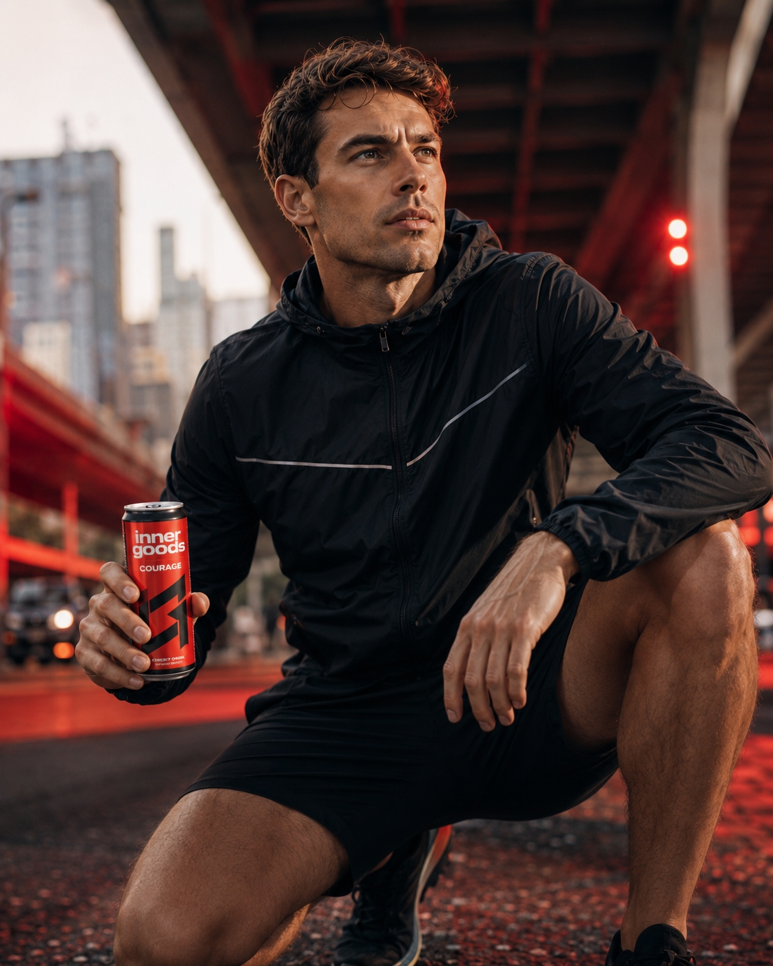
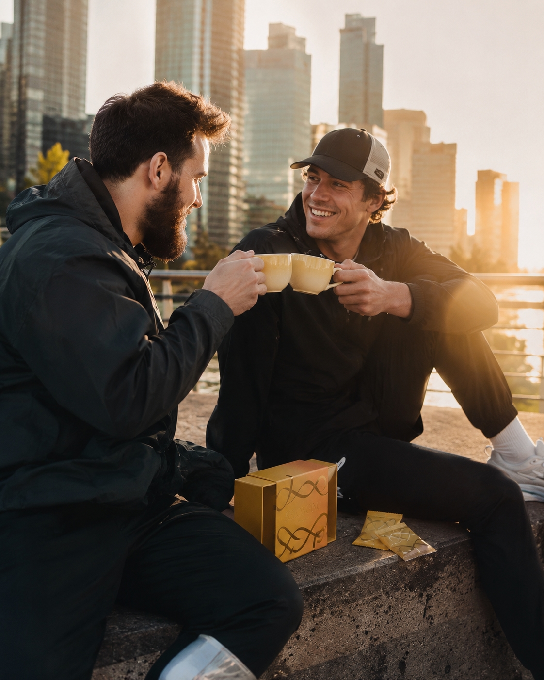
The new situational images test whether the products can appear desirable in ordinary social contexts before the product page reveals what they cannot actually solve. They are deliberately kept in the case study as part of the experiment rather than presented as final campaign work.
The product page is the argument
Every product page runs the same sequence, in the same order, like a pharmaceutical insert:
- What the category claims this object delivers.
- What is actually in it.
- What it actually costs you, the part the category leaves out.
- What happens when it works.
- When not to buy this.
- The practice that would actually address the need.
Real Cost is the pivot. It is the only field that breaks the fourth wall, and it is set in the one accent colour the system uses. Every catalogue item is shown at $0.00 USD because the fulfillment of higher needs has no direct financial cost, and the real alternatives are often free. The store shows the object and explains the real cost on the same screen, without either statement cancelling the other.
Product pages
The Courage product page makes the argument testable. It presents the object, then turns the promise into a question about the need behind it.
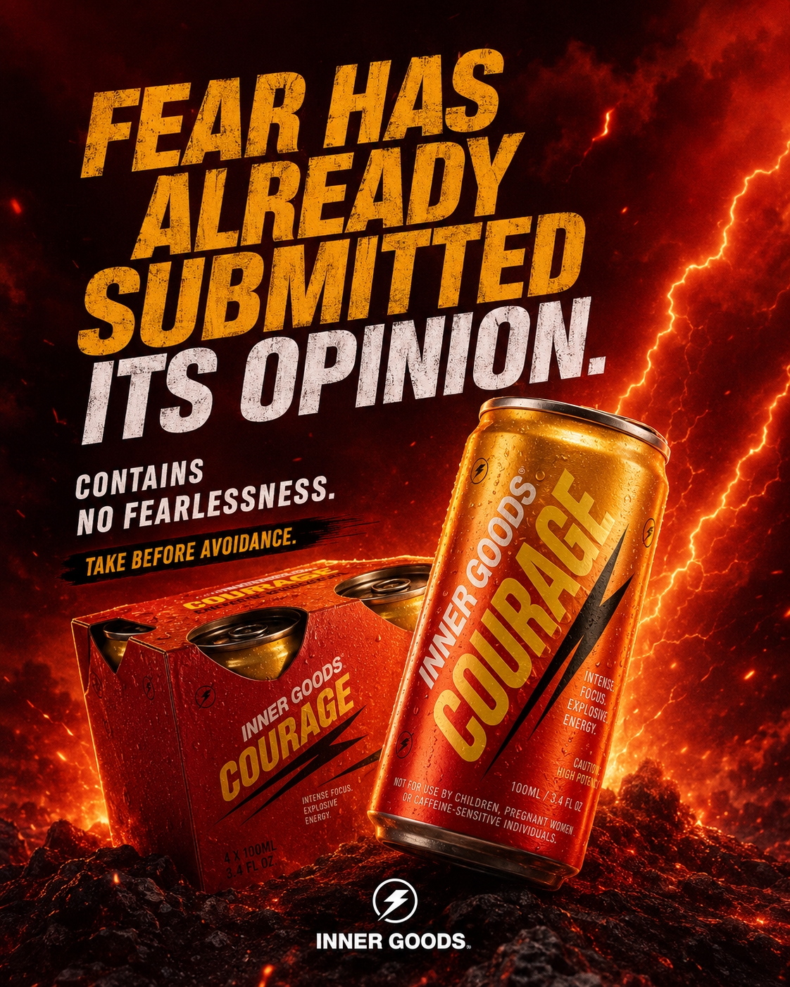
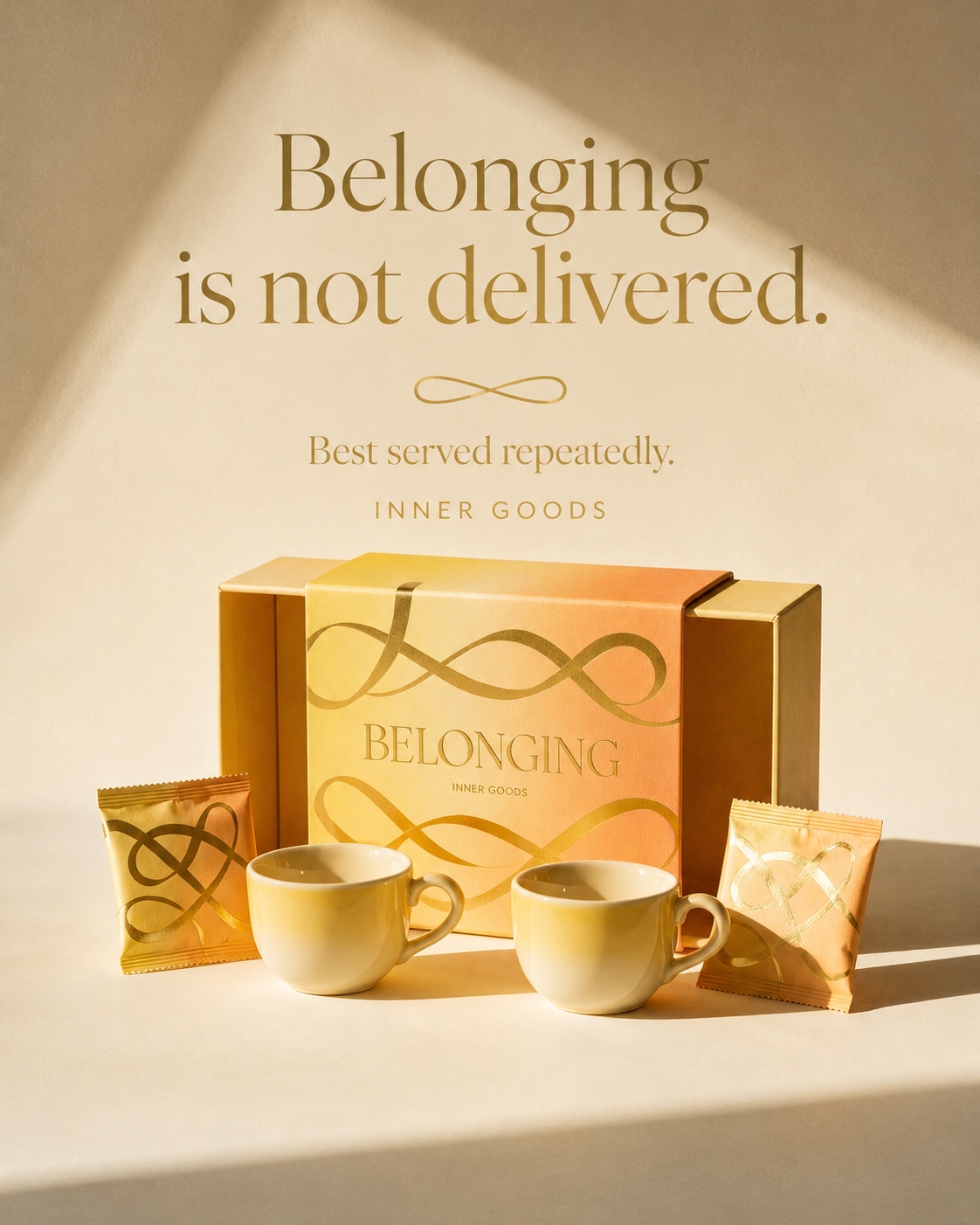
The imagery is the experiment
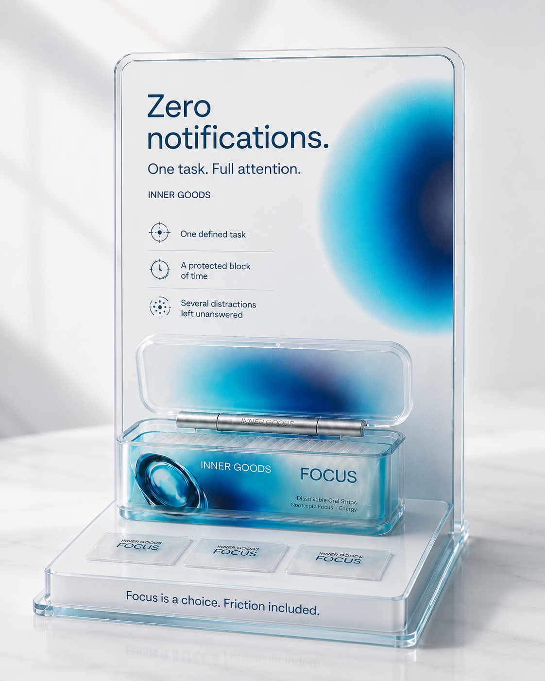
This is explicitly an experiment with AI-generated images. The current visual set was made with Seedream, under the no-Photoshop-retouching constraint above. The pictures are a first pass, not a claim that the visual system is finished: I plan to redo them soon with more powerful models and use that next iteration to improve material consistency, typography and human details.
The workflow matters as much as any individual prompt. Holding a consistent product identity across packshot, environmental ad and retail stand, at consistent lighting and material quality, is a pipeline problem, which is what pushed me into building custom batch nodes for ComfyUI.
Key decisions
Ordinary objects, not absurd ones
An early instinct was to invent products, a bottled emotion, a subscription to meaning. Absurdity would have made it obviously fiction and therefore safe. Using products that already exist and are already sold this way keeps the discomfort where it belongs.
Make the non-commercial status explicit
Every catalogue item is priced at $0.00 USD. The higher-need fulfillment solutions are free, and the real costs are explained on the product pages rather than represented as checkout amounts. The storefront stays a product argument, not a shop pretending to take payment.
Make the checkout the reveal, not the product page
After adding products to the cart and validating the checkout, the "shopper" received a message telling them that higher-need fulfilment isn't related to the purchase of goods.
Impact
All nine products, the full copy system, campaign imagery and storefront are shipped at innergoods.store. The catalogue uses $0.00 USD throughout because it is non-commercial, while each product page explains the real cost and points to a free higher-need alternative.
Limitations and next steps
The next question is whether the format extends, using the same insert structure for categories that are far from being honest about their real cost.